Total Pageviews

Monday, September 12, 2016

Good Evening All,


I think I messed up my last post but at least it has posted now. I hope you all had an amazing Monday!
      So getting farther into this Design competition I am beginning to visualize my Skybox. Without giving too much away I am pulling inspiration and have put into consideration  having hints of art deco throughout and having dark finishes. The space will have a luxurious feel that will oose wealth and the lap of luxury.

It will feel edgy and glam while keeping it femine. 
Will consist of the following, wood, marble, fur and more to be released closer to time, wouldn't want to give too much away. 

Looking forward to the completion of this project as well as seeing the others. 

xoxo -S

 
Hi Guys,

I hope you all had an amazing Summer break, I know I did, spent it with my family in Hilton head. We were worried at first because the forecast was calling for a week of bad weather but it was an amazing week! We laid on the beach the kids learned how to do flips in the pool without their jackets on, took a parasailing adventure and found hundreds of live sand dollars and a couple live starfish. It was an amazing trip that we all will remember.

Jumping back into the groove of school our project for this semester is for a competition in High point. The project calls for us to design a spacious luxury sky box that a recording label purchased to entertain their A-list clients.
Based off a music genre we are to select one type as well as get in mind the type of artist we will be designing the space to please. I am excited about this project, being as there isn't a budget, sky's the limits. I can't wait to see where this takes us.
Well guys heading back to the pintrest board.

xoxo
-S 

Thursday, July 21, 2016

Hello all,

   Ready for Fun in the sun! speaking of fun and sun lets talk a little about our second project for the semester, we redecorated a elementary school in Astoria, Colorado. I was in charge of the cafeteria. We went with a blues and greens color scheme so I took that and ran in the direction of bringing the outside inside. I incorporated that into my design by have a drop down in the ceiling to look like raindrops. A water wall in the front as they enter that is surrounded by bamboo plants. The flooring is the color scheme reflected into wood paneling. Large windows and a cutout wall motif were installed to incorporate more natural lighting throughout the space. All the tables can collapse as well as the side right wall in order to accommodate an event the school might hold. Below is my renderings of my design for the West Haven Cafeteria.

I hope you all have a great break! until next time
-Stef
Almost there,


     Happy Thursday, it's been awhile since I have been on here but I'm back and ready to finish up.
So this Summer session I have taken Commercial 1, in this semester we had to complete two very different projects. The first project was a Company called Marquis Seating we designed the front reception, open office spaces, as well as the break room. I started thinking about what kind of atmosphere I would like to work in every day and I went from there. First we read the client profile to really get a better grasp on what exactly the client would like to see in the finished space. My final design for the client was very fun, open, and also colorful. I incorporated the colors of the company's logo throughout the space. The M is the logo emblem for Marquis is located in the center of the floor as you enter the reception area (as shown below). This project was a lot of fun and I enjoyed experimenting with color.  Ready for a much needed vacation.


Have a great Break!!
Stef

Monday, May 6, 2013


Happy Monday everyone, 


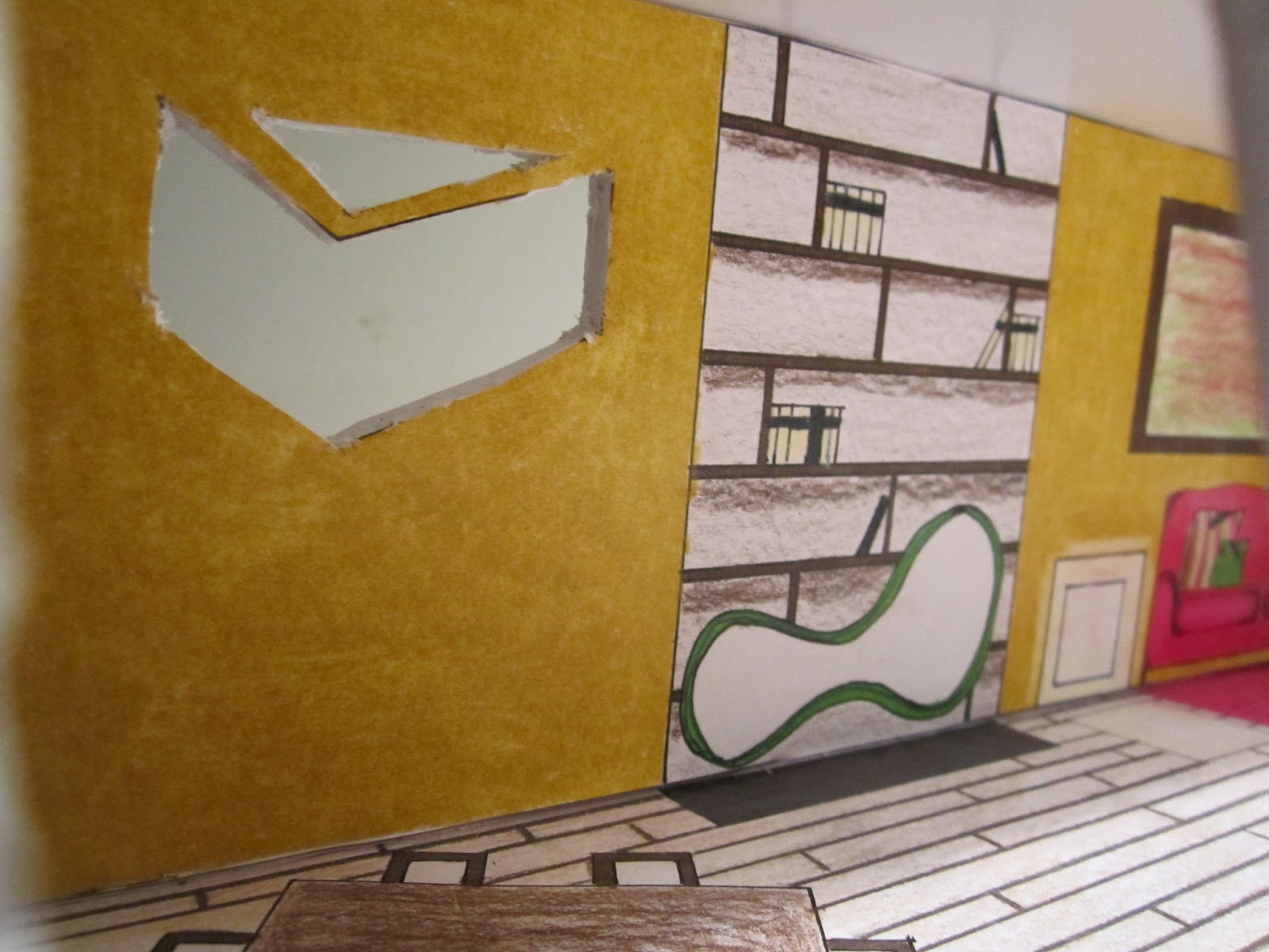
This photo below is a picture of my reception space I designed in sketch-up.
I love the process of this because when it is finished it looks so clean and presentable. I chose to have bookshelves covering the back wall so that  it looks balanced. I felt like by doing this it made the room have more character and that it works well with the other pieces in the room. I hope you enjoy and stay tuned we have a two week break coming up but after that I will be back for more blogging about RCC's Interior Design program. 


Thursday, May 2, 2013


Finally finished with the commercial project for design class it was a blast and I think it turned out nicely. This project we had to design a cupcake shop for a business man in the Charlotte area named  Mr. Dwyer. He wanted a cupcake shop that was gender neutral and modern or contemporary.So this brought me to a clean look with dark hard wood floor, and the space has an elegant feel.  Chandeliers, drapery sheer fabric that create a wall divider between each sectional sofa. 


 We began our project with an adjacency matrix to help us figure out where the best place for everything to be placed was and with what. For example the kitchen need to be paired with the fridge/freezer and the office space. Another example is the negative adjacency matrix, meaning the things that shouldn't be placed together don't get placed together. Example the bathroom shouldn't be placed with the kitchen.


 Floor Plan 
This is my take on the space, by looking at this floor plan you can see where everything is placed. Also you can see the patio area with the fountain and the loungers. The geometric look figures with the dots in them are show to give he look of bricked in plants. The circles in the middle of the floor in the space are booths. 


This is a rendered elevation of the cash wrap to give the client an idea of what it will look like. I also showed in this elevation where the light will hit the back wall. 


This lounge wall elevation is to show how the final will look once it is built. The white lines separating each of the sectional sofas are airy curtain wall dividers. So that the client has a elegant yet intimate feel when they are sitting in the lounge area. 

My Architectural inspiration for Mr. Dwyer’s cupcake shop came from the thought of being on vacation and wanting to be elegant and dress up but also be free and laid back. So in saying that I came up with the concept of making the ceiling have runners in a semicircle shape that have curtains that hang to floor length that block a portion of the sofa from the shoppers view. Being on runners the loungers have an option of having the space open of sectioned off. My second Architectural inspiration I had for Mr. Dwyer’s cupcake shop was the floor to ceiling windows, this feature helps let in natural lighting which helps cut back on lighting cost. 

Finishes and furniture. While deciding which pieces to choose for this design I went with a more elegant feel. I want the customers to feel like they have been whisked away to a flowy yet elegant lounge where they can feel classy but also let their hair down a bit in the secluded lounge feel. Each sectional sofa has sheer curtains surrounding them so that if the group would like to be more sectioned off like a party room they can just pull the curtain that is suspended on a runner and glide it around to a given point. I chose colors that I feel are timeless yet elegant. With an airy light feel. The floors are a rich cocoa wood, while the two outer  sofas are the same color turquoise as the wall behind the cash wrap


I thoroughly enjoyed this project. I loved getting to design such a cool space like a cupcake shop. Can't wait to start the next project and push myself to keep improving over time here.  


Happy May-Day everyone.

 Finished! finally! 

  The residential project has finally come to a close, During This design project we had the design task of creating a pool house for a modern family. The family said they would like the pool house to be built in a shipping container so that it cut down on cost. By having the pool house in a shipping container it helps cut down on many daily cost. Such lighting because depending on how the windows are placed depends on if your going to need anything other than natural lighting in the space.
 We each designed a look for the house that was both modern and fit the clients wishes but also was a fun environment for kids. My design consisted of dark teak floors so that it is water resistant but also has a nice hard wood floors look. All the furniture is water resistant wood, the couch is in a fun color that is also water resistant fabric so that when the little kids are wet from the pool they wont mess up the furniture.


We photographed all the angles with a shadow so that it can show what it will look like with the light from the sun and shade and  shadow areas. 

 My final presentation board for this residential project of the pool house. 

Thank you for reading stay tuned for more projects to come.