Finally finished with the commercial project for design class it was a blast and I think it turned out nicely. This project we had to design a cupcake shop for a business man in the Charlotte area named Mr. Dwyer. He wanted a cupcake shop that was gender neutral and modern or contemporary.So this brought me to a clean look with dark hard wood floor, and the space has an elegant feel. Chandeliers, drapery sheer fabric that create a wall divider between each sectional sofa.
We began our project with an adjacency matrix to help us figure out where the best place for everything to be placed was and with what. For example the kitchen need to be paired with the fridge/freezer and the office space. Another example is the negative adjacency matrix, meaning the things that shouldn't be placed together don't get placed together. Example the bathroom shouldn't be placed with the kitchen.
Floor Plan
This is my take on the space, by looking at this floor plan you can see where everything is placed. Also you can see the patio area with the fountain and the loungers. The geometric look figures with the dots in them are show to give he look of bricked in plants. The circles in the middle of the floor in the space are booths.
This is a rendered elevation of the cash wrap to give the client an idea of what it will look like. I also showed in this elevation where the light will hit the back wall.
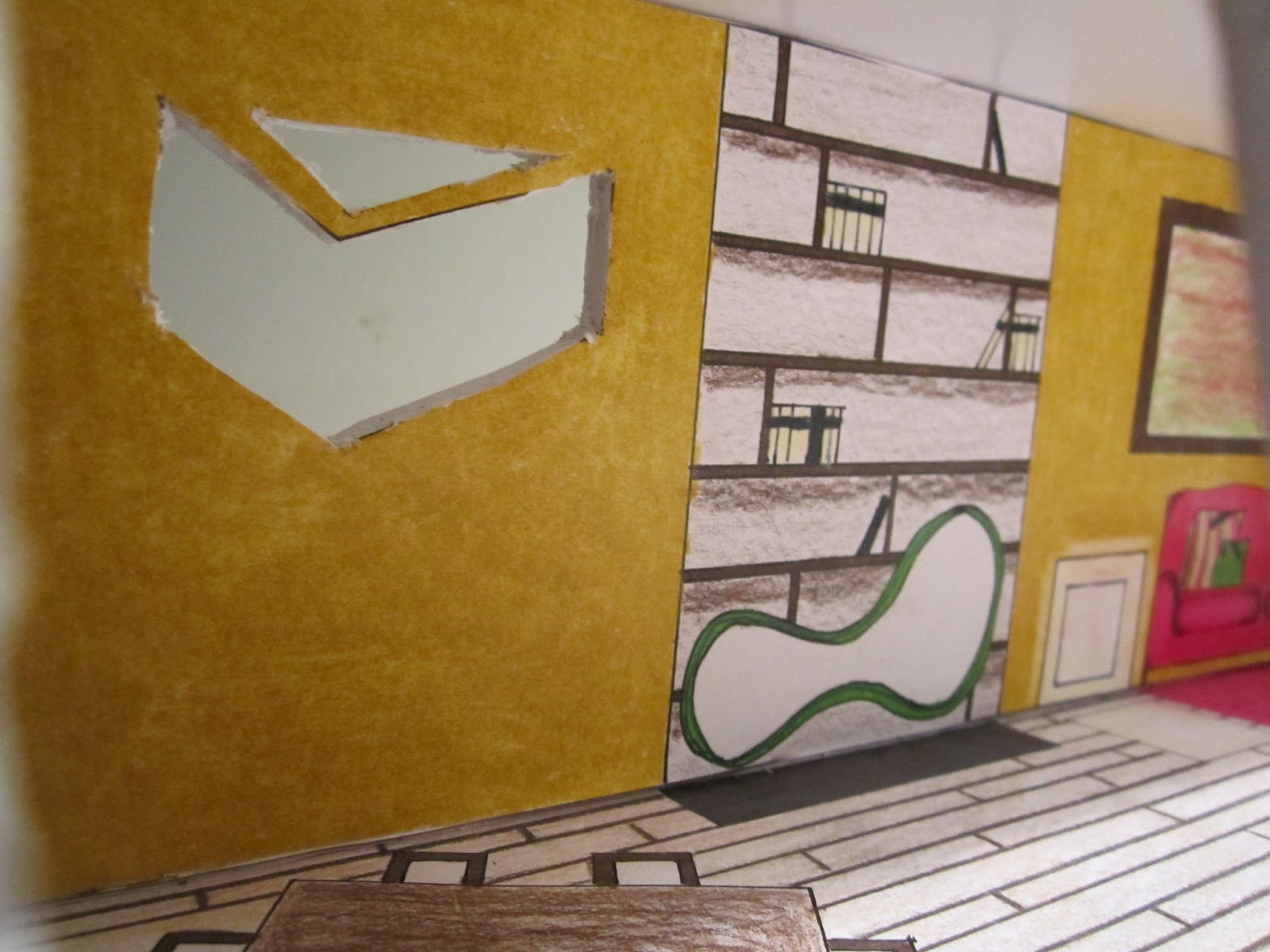
This lounge wall elevation is to show how the final will look once it is built. The white lines separating each of the sectional sofas are airy curtain wall dividers. So that the client has a elegant yet intimate feel when they are sitting in the lounge area.
My Architectural inspiration for
Mr. Dwyer’s cupcake shop came from the thought of being on vacation and wanting
to be elegant and dress up but also be free and laid back. So in saying that I
came up with the concept of making the ceiling have runners in a semicircle
shape that have curtains that hang to floor length that block a portion of the
sofa from the shoppers view. Being on runners the loungers have an option of
having the space open of sectioned off. My second Architectural inspiration I
had for Mr. Dwyer’s cupcake shop was the floor to ceiling windows, this feature
helps let in natural lighting which helps cut back on lighting cost.
Finishes
and furniture. While deciding which pieces to choose for this design I went
with a more elegant feel. I want the customers to feel like they have been
whisked away to a flowy yet elegant lounge where they can feel classy but also
let their hair down a bit in the secluded lounge feel. Each sectional sofa has
sheer curtains surrounding them so that if the group would like to be more
sectioned off like a party room they can just pull the curtain that is
suspended on a runner and glide it around to a given point. I chose colors that
I feel are timeless yet elegant. With an airy light feel. The floors are a rich
cocoa wood, while the two outer sofas
are the same color turquoise as the wall behind the cash wrap
I thoroughly enjoyed this project. I loved getting to design such a cool space like a cupcake shop. Can't wait to start the next project and push myself to keep improving over time here.